Lest We Forget
By Mitch Berg
What does this chart represent?
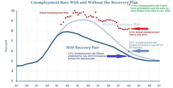
No, it’s not the Brett Favre Media Bell Curve. It’s the comparison between:
- Obama’s projected unemployment with Porkulus (Dark blue line)
- Obama’s projected unemployment without Porkulus (Light blue line)
- The actual unemployment rate (Red dots)
Question for all you Democrats; if Romney releases his tax returns, will those red dots merge with the blue line?
(Via Instapundit)


August 21st, 2012 at 12:58 pm
I’ve read that Obama is afraid that, if he loses, Romney will get credit for the recovery that is waiting just around the corner.
Jesus !@#$% Christ, there is no recovery just around the corner.
August 21st, 2012 at 1:12 pm
If there ever is a recovery, it will be Bush’s fault.
August 21st, 2012 at 1:28 pm
Graphs confuse Obama. Tell him how it impacts women, children and minorities. That’s the part of this graph that isn’t reflective here. This is a dishonest graph if you are liberal.
August 21st, 2012 at 3:04 pm
I’d say that chart represents a 110 vote swing in the electoral college from 2008.
August 21st, 2012 at 5:49 pm
That graph is totally racist.